Disclaimer

DISCLAIMER: All images which are not my own are cited with the source and are used here for educational purposes only. If you would like your images removed please contact me directly and I will remove them immediately. Thank you.
Find me more frequently for the time being at Folk-Art-Life.

3.27.2011

A little bit o' press never hurt no one...


Okay... I'm going to contain my excitement. Although I haven't been so delighted for myself in quite some time. Maybe since I realized I had readers on every continent save Antartica. P.S. If anyone is reading from there please let me know. ;) 


Author, and awesome young potter, Avi Arenfeld included (Mud)Bucket in a great article on blogging potters in the Winter 10/11 issue of Clay Times. How cool is that? I guess the Mug of the Month posts were a real hit. They've even inspired another budding potter to do the same.

I can't believe it took me until March to catch up on my ceramic print-media reading, but I still want to say thank you so much to Avi for including me in the article and welcome to any Clay Times readers who are here for the first time because of the article. 

I put a lot of my heart into this blog and it always makes it worth it to learn how much all of you enjoy reading it.

Thank you so much! 

Pete Scherzer


Back to some regular programming, ay? How about some delicious pots from Pete Scherzer to start us off? I love everything about these pieces, they are so complete. Do you know what I mean? Every aspect of this pottery feels so intentional and integrated with the next. The color, the clay bodies, the texture, the shape, the patterning. I would love to take a workshop with this artist. Anyone been so fortunate?

(images via Schaller Gallery and artist's website)

3.13.2011

Studio Time: Surface Design


Okay, so can you tell, I've totally been sick for the last three days. Hence my mass-posting of things I've been meaning to post for some time. No pressure to read it all at once. Take your time to peruse, it might be a while again before I have time to post. Who knows.

Anyway, I wanted to share a little doodling I've been up to in my Surface Design class. We've been doing a whole heck of a lot of stenciling... Which is cool. I actually really like the motifs I've come up with so far. It started out with a bunch of automatic drawing (top) do loosen up and get some pattern ideas out on the board. Truth be told, I think my intructor was just trying to gauge where the everyone in the class was on the uptightness level and let people adjust a bit to his teaching style. But that's just me. He, he. 


Sampling started with some pigment (screen printing ink) and over-dyeing. I kind of cheated and pre-dyed my fabric swatches with thickened dye. We were supposed to be experimenting with different stenciling techniques many of which you can read about in the book, Printing by Hand by Lena Corwin. I employed the traditional stencil cut from plastic film method and the stencil cut from waxed butcher paper method. I loved the clean lines of the butcher paper stencil. Can you tell which part is from that method? Because I'm really into this compositional thing at the moment I added some embroidered images that were inspired by an old magazine article from 1951.  I'm really digging the way these are starting to look like textile paintings. And they remind me of some of my work from last semester.


These last two pieces were my second set of samples. Here we were testing different dyeing methods. I painted the fabrics with one color of fiber reactive dye (used for cotton and other bast fibers) and then experimented with some thickened discharge applied with a squeeze bottle quite like I apply my underglaze designs in ceramics. I'm hoping to stitch on to these samples as well, but I'd like to use some sketches of children from old family photographs. I'll share as soon as I do.

Our newest sample assignment is all about stamping and very basic repeat pattern. I'm not a basic repeat kinda gal so this might be difficult. I have died my samples lovely shades of lime and aqua, however, which I'm excited about. And I also found that the ends of cheap plastic thread spools make a lovely lotus root-esque stamp or something similar to an okra print. This might work it's way into my clay somehow. Yes?

I'll be sure to post upcoming samples soon. :)

Setting the Table: Miami Poolside


I ran into this gorgeous photograph by stylist Jessica Thomas on Desire to Inspire. It's a beautiful kitchen to be sure, but what I love most is the light in the photograph. I imagine that just to the right of the sink is a pair of open french doors that lead to a beautiful pool and terrace on a bright sunny day. The atmosphere is cool and relaxing from the shade on the terrace to the cool touch of the backsplash tiles and a soothing dip in the shallow pool. I know I'm just creating this senario in my imagination, but I think I'm going to have a hard time leaving.

Here's how I'd set the table... 


By the sink I'd keep a fancy bar on Rebecca Chappell's soap dish (1, $50) to wash up between the pool and cooking. I'd fix the counter with a gorgeous spray of lilies in one of Scott Jennings newly designed geometic vases (2, $135). To keep my collection of relaxing teas fresh, I'd store them in a couple of lovely jars from Pincu Pottery (3), always at hand on the countertop.


For brunch on weekends, I'd set the table for seasonal fruit salad in bowls from Jeff Campana (4, similar, smaller bowls $95) and french toast on plates from Karl Borgeson (5, $150). Accompanying the morning treats would be cinnamon and brown sugar in a spice well set from Gwendolyn Yoppolo (6) and creamy butter in a dish by Joanna Howells (7).


After the morning's first dip I'd bring out some cups and saucers by Mike Jabbur (8) and a few treats on a dessert tier from Joanna Powells (9). From a soda-fired teaset by Tara Wilson (10), I'd pour a pipping service of mango-black tea while my guests enjoyed a few bittersweet-chocolate-covered fruit jellies.


After tea while my guests went in for another dip I'd grab my clever citrus reamer by Gwendolyn Yoppolo (11) and quickly juice some of the fresh lemons I keep on this clever fruit dish by Joanna Howells (12). Poured over some soothing ice-cubes with a bit of sugar added, my fresh batch of lemonade would be especially sparkling spilling from this Mark Knott pitcher (13, $150).


My delicious lemonade would taste so crisp out of these fancy cups from Victor Visockis (14, $65). A cool service of chilled washcloths in a dish by Marc Digeros (15) and sliced cucumbers on a stunning platter by Honest Works Pottery (16, $65) would complete the spa experience. 

Ahhh, what a relaxing day... Do I really have to wake up?

------------------------------------------------------------------
If you have a photo that you'd like to see with a 'Table Setting' shoot me an email. I love a challenge.


3.12.2011

On Etsy: Whitney Smith


artist blog
artist Etsy shop
artist website

Why I love it: I have been reading Whitney Smith's blog for quite some time now, and have been meaning to include her work on (Mud)Bucket just as long. More than being a fabulous potter, Whitney is a most incredible business woman. She shares so much advice and insight on her blog, This Artist's Life, it's an invaluable resource for potters today.  I love her work because it looks like such an incredibly modern interpretation of traditional asian ceramic styles: celedon, porcelain, cherry blossom motifs, floral shape inspirations. It's all so feminine and sharp at the same time. I also really dig the fact that Whitney has a registry available for her work. What a clever idea! Why don't more potters offer this? Also, if you want to read a great interview with this hardworkin' gal, check it out on sfgirlbybay.

P.S. Doesn't Whitney take wonderful product photos?


Workshop Review: Diana Fayt


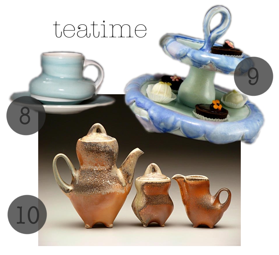
Here are some images of the work I got to create during 
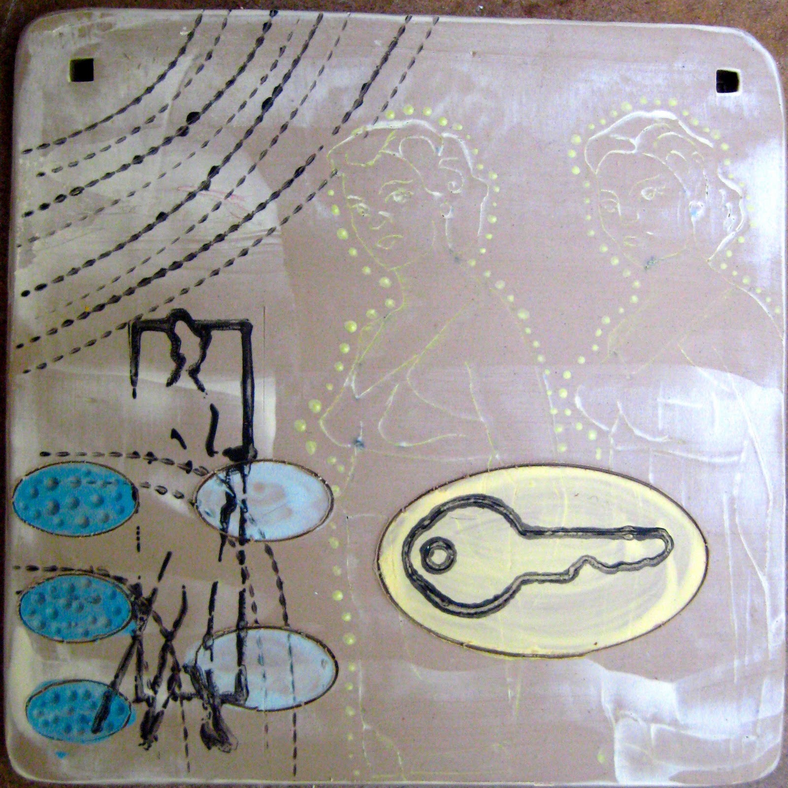
Diana Fayt's workshop last weekend. It was so much fun! I haven't been to a workshop where I got to make something in some time. It was really nice to be able to play in such a different style then I am used to and it loosened up my ideas about working on the surface.  I think workshops where you actually get to make something are really important for artists. When you are working in such an uninhibited situation where you're investment in the work is so much less than in your own studio work, you are free to unlock new ideas that maybe you never even really knew existed in the recesses of your imagination. I feel like the images I chose to bring to Diana's studio, and then work with during the workshop, were selected so spontaneously that I came across this intuitive content choice that I probably wouldn't have otherwise. 


Does that make sense? When you choose things quickly and without the limitations of your own judgement, surprises happen. My textiles professor, Vic de la Rosa, is prodding us to do this in our Surface Design class. We've been doing sampling and automatic drawing like crazy, just picking up random materials and then employing them randomly to create patterns and compositions on fabric. Diana's workshop was a similar experience for me; and the images I chose to make the tiles in her studio have already found their way into my textile work. Who would've known?


Now the only think that is racking my brain is this concept of copyright. Ugh! What a bummer. Does anyone have experience with this issue in their own work, regarding derivative images, from old magazines, newspapers, and such? 


Anyway onto some of the things I learned at Diana's workshop:

-Recycled paper withers against the moisture of wet clay. Use non-recycled paper or other non-paper materials for image transfer if you care to use the image repeatedly or don't want the hassle of picking paper pulp off your surface. I had to learn this the hard way.

-There are stamp-pads for clay! Made by Minnesota Clay Company. I knew I should have been collecting stamps all this time.

-Make your own rules! This was my favorite. We are very beholden to tradition in ceramics, whatever that means, and I think this can have a stunting or lagging effect on the evolution of our art form at times. Sometimes we have to remember that rules were made to be broken, in fact, that's exactly how new rules are made! :)


It goes without saying I think, but I'll say it anyway. If you ever get the chance to take a workshop with Diana by all means do it. She is a great teacher, incredible artist, and a lovely person. Did I tell you she set out tea and coffee and cookies for us? Isn't that so thoughtful? I was truly impressed by her hospitality and the relaxed energy in her studio. I can't wait to visit again. And how lucky? It just so happens that my Professional Practices class is visiting her studio in a couple of weeks. I get to pick my tiles up then, all glazed and fired. Eek! I can't wait.

Diana has three more workshops scheduled this year, thought I'm not sure how many slots are left, so check them out quickly if you're interested. She will be giving another one-day workshop in her own studio here in San Francisco in April, a five-day workshop at Sierra Nevada College in Lake Tahoe in July, and a three-day workshop at Mudfire in Decatur, Georgia in September. Sign up if you can, you'll be so glad you did. :)


3.09.2011

Project Color Theory: Potted Cacti


Here is another one of my color studies... I've been working from this set (and the previous butterfly set) quite a bit in class lately.

I think that it’s really important to consider color theory in your creative process. As highly visual creatures, color acts as an incredible informer of our experience. By harnessing the emotional, cultural, and psychological associations of different colors and color combinations we can better inform our work.  In doing so it is not merely possible, but extremely likely that we will convey more deeply and completely the messages we intend for our audience.

That being said, allow me to ponder what the above color palette signifies to me.  To begin simply, various shades of green and yellow complemented by a terracotta orange evoke the earth immediately.  The terracotta color will forever remind me of the warmth and openness of the southwestern deserts as such bright greens conjure the fresh ferns of California’s coastal forests and the succulent gardens so popular in the beach towns along Highway 1. To me these colors represent my environment- past, present, and future.

In a more academic reading we have a set of tertiary colors that are complimentary. Because green and orange are near opposite on the color wheel we can say this combination has a certain amount of tension. Tension doesn’t have the negative connotation in color theory that it does in, say, psychotherapy. Here, the term tension simply means the not completely harmonious. Orange and yellow are warm colors associated with happiness and green is a cool color associated with growth and prosperity.  If I were trying to convey a sense of isolated angst, these colors wouldn’t work very well because their combination brings a sense of comfort, home, and cultivation.  The combination of warm and cool colors also keeps the combination from feeling strictly hot or cold. In a more functional concept, that could mean the colors would be appropriate for vessels that hold either cold or hot beverages. Does that make sense? 

Do any of you pay special attention to these concepts when surfacing your work?

(original image via sproutworks on Flickr)

3.02.2011

Video: Gerit Grimm


What an inspiring little sneak peek. I can't believe that Grimm uses the wheel to make her work. How fantastic!


Studio Time: a teapot and then some


Some wet work in progress. I'm hoping that teapot makes it all the way with out twisting the wrong way in the firing process. I bumped the handle while putting something into the damp box and had to reposition it. I think it might totally ruined but we'll see. I made up some thick slip for slip trailing, I'm excited about this new possibility. Also I'm in love with the cruet set I finished a few days ago. In love.

Question, though, is that handle too big? Is the spout too small?

3.01.2011

Open 4 Discussion: The Importance of Process


I found this nice little ceramist spot with Elephant Ceramics on Design*Sponge, just now during my morning coffee blog stroll. I have a slightly tilted reaction to work like this. In my ceramic-traditionalist brain I'm thinking 'those are just slabs thrown over a hump mold with the edges chopped off and the texture hasn't even been removed." Okay, then I remind myself to think about whether I like it before I critique how it's made (which I know little to nothing about actually). I ask myself, "Is it pretty?" And surprisingly I answer YES! I like it. I know not everyone is as fond of rustic aesthetics as me but I love the unrefined. This little moment made me consider why we think process is so essential to art. I'm learning about this now in contemporary art history. And to me, the process isn't essential to the work, as long as the work can stand on it's own. Now I'm not saying that this collection represents the best of contemporary ceramic art... I don't think that's what the potter is attempting here. I guess its a means and ends question.... Does anyone else ever consider this?

How important do you think process is to the value of the finished work?

(image via artist's website)

Related Posts with Thumbnails