Disclaimer

DISCLAIMER: All images which are not my own are cited with the source and are used here for educational purposes only. If you would like your images removed please contact me directly and I will remove them immediately. Thank you.
Find me more frequently for the time being at Folk-Art-Life.
Showing posts with label Studio Time. Show all posts

4.18.2011

Studio Time: At The Wheel Again


A couple of weekends ago I tried my hand again at the wheel... it's been almost two years... Can you believe it? Well... Navajo Wheel is butter, which makes it so delicious but also so cantankerous if you're out of practice. This, sadly, is all I got in about an hour's worth of throwing. They are still in my damp-box, waiting for some white slip mishima, growing mold, and probably structurally deteriorating because of it.

We'll see. I'm kind of going through a clay-oriented chrysalis-stage at the moment. Stick with me, though... there might be wings on the other side.

4.11.2011

Studio Time: Textile 'Paintings'


So... just a little update on what I am working on now. I consider these studies for what will eventually develop into textile paintings of sorts. And I see these also branching off and growing into ceramic scrolls... Have you ever considered how similar embroidery and mishima are?

Molly Hatch, I might have finally found the proper application for your fancy technique.

P.S. Folks, don't worry. I have not forgotten about clay. I just have been a bad studio girl lately. More projects coming soon.

3.13.2011

Studio Time: Surface Design


Okay, so can you tell, I've totally been sick for the last three days. Hence my mass-posting of things I've been meaning to post for some time. No pressure to read it all at once. Take your time to peruse, it might be a while again before I have time to post. Who knows.

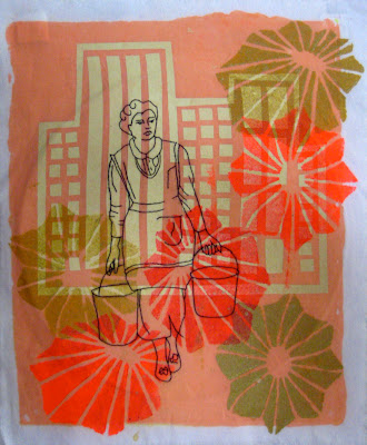
Anyway, I wanted to share a little doodling I've been up to in my Surface Design class. We've been doing a whole heck of a lot of stenciling... Which is cool. I actually really like the motifs I've come up with so far. It started out with a bunch of automatic drawing (top) do loosen up and get some pattern ideas out on the board. Truth be told, I think my intructor was just trying to gauge where the everyone in the class was on the uptightness level and let people adjust a bit to his teaching style. But that's just me. He, he. 


Sampling started with some pigment (screen printing ink) and over-dyeing. I kind of cheated and pre-dyed my fabric swatches with thickened dye. We were supposed to be experimenting with different stenciling techniques many of which you can read about in the book, Printing by Hand by Lena Corwin. I employed the traditional stencil cut from plastic film method and the stencil cut from waxed butcher paper method. I loved the clean lines of the butcher paper stencil. Can you tell which part is from that method? Because I'm really into this compositional thing at the moment I added some embroidered images that were inspired by an old magazine article from 1951.  I'm really digging the way these are starting to look like textile paintings. And they remind me of some of my work from last semester.


These last two pieces were my second set of samples. Here we were testing different dyeing methods. I painted the fabrics with one color of fiber reactive dye (used for cotton and other bast fibers) and then experimented with some thickened discharge applied with a squeeze bottle quite like I apply my underglaze designs in ceramics. I'm hoping to stitch on to these samples as well, but I'd like to use some sketches of children from old family photographs. I'll share as soon as I do.

Our newest sample assignment is all about stamping and very basic repeat pattern. I'm not a basic repeat kinda gal so this might be difficult. I have died my samples lovely shades of lime and aqua, however, which I'm excited about. And I also found that the ends of cheap plastic thread spools make a lovely lotus root-esque stamp or something similar to an okra print. This might work it's way into my clay somehow. Yes?

I'll be sure to post upcoming samples soon. :)

3.02.2011

Studio Time: a teapot and then some


Some wet work in progress. I'm hoping that teapot makes it all the way with out twisting the wrong way in the firing process. I bumped the handle while putting something into the damp box and had to reposition it. I think it might totally ruined but we'll see. I made up some thick slip for slip trailing, I'm excited about this new possibility. Also I'm in love with the cruet set I finished a few days ago. In love.

Question, though, is that handle too big? Is the spout too small?

2.22.2011

Studio Time: Doodle Tiles


Played with some new toys yesterday. Some makeshift stamps, an etching pencil (a la Michelle Summers), and a slab bevel-maker-thingy.

I had fun trying out some new surface techniques. Can't wait for Sharon and Diana's workshops.


2.20.2011

Studio Time: Second Glaze-Firing


Got these out of the kiln yesterday morning.

The good news?

-they look less like Kiefer-Schroeder-Host knock-offs post-firing
-nothing exploded
-I like the crayola colors
-the giant bowl didn't crack


The bad news?

-they're boring as all hell
-I obviously did not put the same number of coats of slip on the Navajo Wheel pieces so they look incongruent and goofy as all hell
-a couple pieces actually did crack
-my Laguna glazes disappeared on the test pieces

So- back to the drawing board, wherever that thing is.

Does anyone have experience firing Laguna mid-range glazes to ^6? I got a couple of matte glazes to try out, but I think taking them to ^6 defeated the matte quality and the color. What do you all think?

Also does anyone have experience with enamels? Like, how do they work exactly?

2.08.2011

Studio Time: Look-alikes


I felt like I had the most amazing a-ha moment on last night at the studio. Like I'd struck some kinda gold decorating some bisqued white stoneware pieces. Then the more I looked at them I felt like they resembled something too familiar. When I realized how closely the patterns resembled Emily Schroeder's work, I felt this cringe in my gut. Now, it's no secret that I am a huge fan of Schroeder, but I wasn't intending to mimic her work, nor was I even thinking of her work when I was decorating the pieces above. Somehow, though, it still seems I've channeled her designs into my work. I'm not really into this... and hopefully this is just one stage in the development of my own style. I'm still disappointed a bit though.

How similar do these pieces look to you? Am I being a total nut or does it look like I'm totally ripping someone off? What is a young artist to do when this happens?

2.07.2011

Studio Time: Cream and Sugar


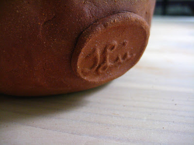
Work in the studio is coming along slowly. I have a new, revised list of pieces to make. That is, all the pieces I failed to make over the summer and then some added bonuses. Like 30 added bonuses. Up top are the cream and sugar set and the final four cups for my whiskey set. Also a close up of my new signature stamp (it's too big but whatever for now), a salt cellar with spoon, some three-dimensional doodles, and some stamps. I also tested some beads I had laying around for textures and got some pretty awesome results. A trip to the bead store might be called for.

Update: My stamp is too big. I know. It is also too -there-. Until I make a new signature stamp I think I might just stamp the bottom rims of my piece. Also, I came up with a winning surface design tonight me thinks. I'll share as soon as I get the new pieces out of the kiln.

How do you all feel about signatures? Should they be visible or hidden? Why do you think so either way?


12.08.2010

Studio Time: From my first firing at Red Brick


Alrighty folks... there she is. The contents of my first glaze firing at Red Brick Studio all by my own self.

Excuse me while I have a moment.

......Moment.....


Ehem. Okay, well this was a highly successful first firing. Several pieces came out wonderfully and I learned a lot about the materials I've been using. Even the pieces that came out like "Wha-wha-whaaaaaah" gave me a heck of a lot of valuable information such as... Mint green, chartreuse, and orange (as below) are where it's at. Navajo Wheel goes deep chocolate brown under a clear glaze. The white slip is too cloudy over that chocolate brown, but the underglazes are killer directly on top of it. The brushing glaze seeps beyond its original edges and some of the underglazes flux, hence the perfume bottles below are cute but completely non-functional. Also, some of the underglazes fizz up over the glaze and cause lava-look when applied too thickly (you can see it in the third photo down if you click and make it bigger).


The final lesson? Run with it girl! And don't be afraid to fire things. You can do it!


Here's the test pot with the Navajo Wheel. Can you kinda see what I mean about the white slip? Yuck. To see more shots of the good stuff, you can check the gallery on my website.

Ugh. Also I just applied for the Design*Sponge 2010 Scholarship. I'm very nervous. I wrote about 1700 words total (that's not even close to the maximum they assigned) about how awesome and deserving I am. It was like pulling teeth. Trying to come across as confident when all you can think about is how many awesome students are going to be applying for this scholarship is sooooo hard. And then on top of that you have to sound interesting and intelligent and promising. I'm a nervous wreck. But I really want this. So badly.

If I end up as a finalist, I'm going to really count on all of you, my wonderful readers, to rally behind me, because the winners will be chosen by a reader vote. Will you do that? Please say yes.


12.07.2010

Studio Time: Preparing to fire for the first time


Wowza!

Tonight I loaded one of the kilns and embarked on my first real glaze firing at Red Brick Studio. I'm so nervous, but also extremely excited. Unloading will happen promptly tomorrow evening around 7. Eek! Can't wait to share what happened.


Also these are a couple of test pots of Leslie's U-Series underglazes  (at ^6). These things are super amazing and most fire all the way to ^10 with very little change in color. Does anyone have any suggestions for another underglaze series that hold their brilliancy that high?

10.28.2010

Studio Time: Contemporary Fiber Forms


Here are my projects from my textile sculpture class.  I'm having fun in this class but I have to say it's not quite as exciting as I thought it was going to be. I feel like my teacher has certain ideas about what it is she want's us to create that make me feel limited in what I can do. But I'm trying my best and she seems to be pleased with my effort. So this is what I've got so far... 

At top is my third project, soft sculpture. I call it A Chair for Dreaming.  It was quite a challenge and took much more time to complete than I had expected. My work in weaving suffered for it, unfortunately.

Just above is my second assignment, fitted transformation. We had to draft a pattern for an object and use that to transform the object from its original state. My original objects were plain glass teacups. I wanted to transform something everyday and mass-produced into something whimsical and unique.  I call this piece Tea with Wayne and Mary because to me the cups look like physical manifestations of the work of Wayne Thiebaud or Mary Engelbreit.

Anyway, next up is an assignment on structure. Hmm... I dunno, we'll see about that one.

10.27.2010

Studio Time: Beginning Painting


So I am taking my first painting class ever this semester and it's been kinda rough getting started. Working so representationally and in two-dimension are very foreign modes of operation for me. It was a real struggle to get started but now that we've completed a few projects I'm really having a blast. 

I wanted to share my progress with folks, so here's a little info about the paintings from top down: 

The first assignment was to create a collage from 10 or so ink and water line paintings that we did in class. My inspiration, as you can see, was San Francisco artist Rex Ray. One of my faves. I had a lot of fun trying to emulate his variations of shape and value.

The second assignment was more open- paint a three-dimensional space.  This was the hardest for me. I struggled with figuring out what to paint, how to use the paint, figuring out value scales that weren't just flat acrylic.  It was so hard, but my teacher, Lisa Solomon, was super encouraging and I think her pushing paid off. It looks pretty three-dimensional to me and I learned how to get texture from the medium.

The third assignment was a still life... kinda boring. It's the least successful I think. Or perhaps it's just that I don't like it very much. Still lives without color are very boring I think.

The last assignment was a master study. I chose Ernst Ludwig Kirchner's Das Blaue Mädchen in der Sonne. I love the wild strokes and bold color and the painting makes me think of my Nana which makes me quite happy.  For the reproduction we could only use two complimentary colors so I chose red and green, my favorites.  This one was the absolute most fun to work on. It was so freeing so work so big and loose for someone who is used to painting tiny little precise patterns and designs.  I hope to paint more like this in the next assignment. 

The paintings at the bottom were from a live model we had in class. I've only ever had a live model a couple of times in my life. This was so awesome.  Painting live and so quickly was a great exercise. The first four paintings were five minute poses, the next two were 20 minute poses, and the final two both came from one 40 minute pose. My favorite is the red 20 minute pose.

The next assignment it a figurative/narrative of our choosing using any colors we'd like.  I built my very own canvas for it from hot pink linen so I am quite excited to get started tomorrow... I can't wait!


Related Posts with Thumbnails